

When you are creating insightful visualizations with data, everything depends on the right starting point. Developing a method and having standards for your visuals is critical to building engagement from your audience. You don’t just want something that people can understand, but something that informs them in surprising ways. Accomplishing that objective means spending time to properly develop the question you are really trying to answer. When coaching clients on this I always like to bring them into the formula “IF I KNEW X AT TIME Y, I WOULD DO Z”. This formula is a classic approach in data solutions to ensure the actions enabled by the solution are impactful ones. By defining what you need to know, when you need to know it and what improvement would result you create a clear understanding of what evidence needs to be presented, how timely it must be and what good can come of it.
All too often, I find organizations start this journey by looking at database tables or spreadsheets. That is building the solution in reverse. Often the resulting dashboards reflect the poorly connected thinking that comes from recognizing a number in a column can be summarized, or a set of events can be counted. What you really want is to ask bold questions. Starting with the data will lead you to the same result that you would get if you started an article by thinking about what words you want to write. Displaying information is not about the data, it’s about actionable answers. Without the context of the action you enable, you are lost.
Imagine a sentence like this : If I knew my sales for an offering fell or grew more than 10% from the previous quarter within 1 day after the end of the quarter I could still change our campaigns for the next quarter. The evidence required is a simple calculation, the period of the calculation is well defined as is the subject matter of the calculation. The timeliness of the information is included (it must be delivered within one day after the end of the quarter) and the actions are possible intervention on the current quarter rather than having to wait until the next one. The opportunity presented with this information is clear, and it is not the kind of evidence one would necessarily develop by spelunking through database tables. It must come from a business owner or customer within the context of their objectives.
What you really want is to ask bold questions.
Our team has come across this concern so frequently with clients that we have developed our own visualization workshop as part of a Quick Start package to try to help the organizations we work with through this journey. Fundamentally, we see organizations lack a method and a starting point. To develop the formula above, consider the following steps. First, determine the real question you want to answer. Make it bold! It is perfectly fair to ask if something is “healthy”, or “drifting” to start out. Over time, massage that into the evidence you would look for to determine the answer to your question.
Once you understand what one piece of evidence looks like then start developing an understanding of the kind of data you are looking to use to drive the evidence. Consider things like spacing, hue, gradience, size, shape and how they relate to symbolic relationships, ordinal relationships and purely quantitative data in the evidence you will present. I have found that once the the question is clear, each of the remaining steps feel very natural up to the design of the visualization. Picking from predefined types of visuals is fine, as long as you understand how that representation relates to your answer. For example, if you are trying to compare two populations quantitatively make sure you choose a visual that represents that proportion (for example through size or position).
As an example, I’ll explore relationships that are largely symbolic but have some quantitative detail. For this I am going to use Yellowfin, and take advantage of its tutorial database which comes with the product when you install it. The reason I thought Yellowfin would be particularly helpful here is that the tool has a feature to create charts from Javascript when a predefined visual doesn’t necessarily fit your exact needs. This is important for breaking open otherwise untapped areas of visualization, specifically relationships between symbolic data. Business intelligence tools rarely have much to offer in this way, except for overused tag clouds. Graphical representation of symbolic data however is very important when showing hierarchical information or when show relationships in unstructured data such as text.
I started in this tutorial database which is all fictitious and is made up of a company that sells ski equipment to athletic camps around the globe. I thought a good example question would be “Which companies and regions have the best sales?” I am not including the time component or the action I am taking, which would normally be required because this is just an example to develop the visual. I considered the stacked bar chart first, but the problem was that it limited me to the position of the bar (which could represent company), size of the stacked bar (which could represent revenue per region for that company). However, with that approach I can only look at one quantity. I decided I really wanted to see both number of transactions as well as the total revenue for that company in order to answer my question. That could be done with a trellis, but then I am using multiple plots to show the answer to one question. That is a possible solution, but I would like to aim for more density. My answer was a dendrogram (hierarchical graph representation) that includes clusters of transactions at the graph’s leaf nodes, and color (spanning from red to green) to represent the low and high numbers for that company’s revenue.
The graph allows me to draw a few interesting conclusions. First, company revenue (color) is generally related to the number of transactions (number of leaf nodes on the right) and clearly Buzz Adventures is the winner on that front. However, look at Colour Adventures. They have a fraction of transactions when compared to Buzz Adventures, but their color indicates comparable revenue. This was just an example of choosing a visualization by first asking a question, looking at the type of evidence needed to answer it, the type of visualization that lends itself to that evidence and finally bringing those visual tools into a unified composition. I did this visual using Yellowfin and programmed the chart in D3.
Note if you would like the Yellowfin report and full D3 code to get started with this kind of Javascript charting in Yellowfin then feel free to contact me.
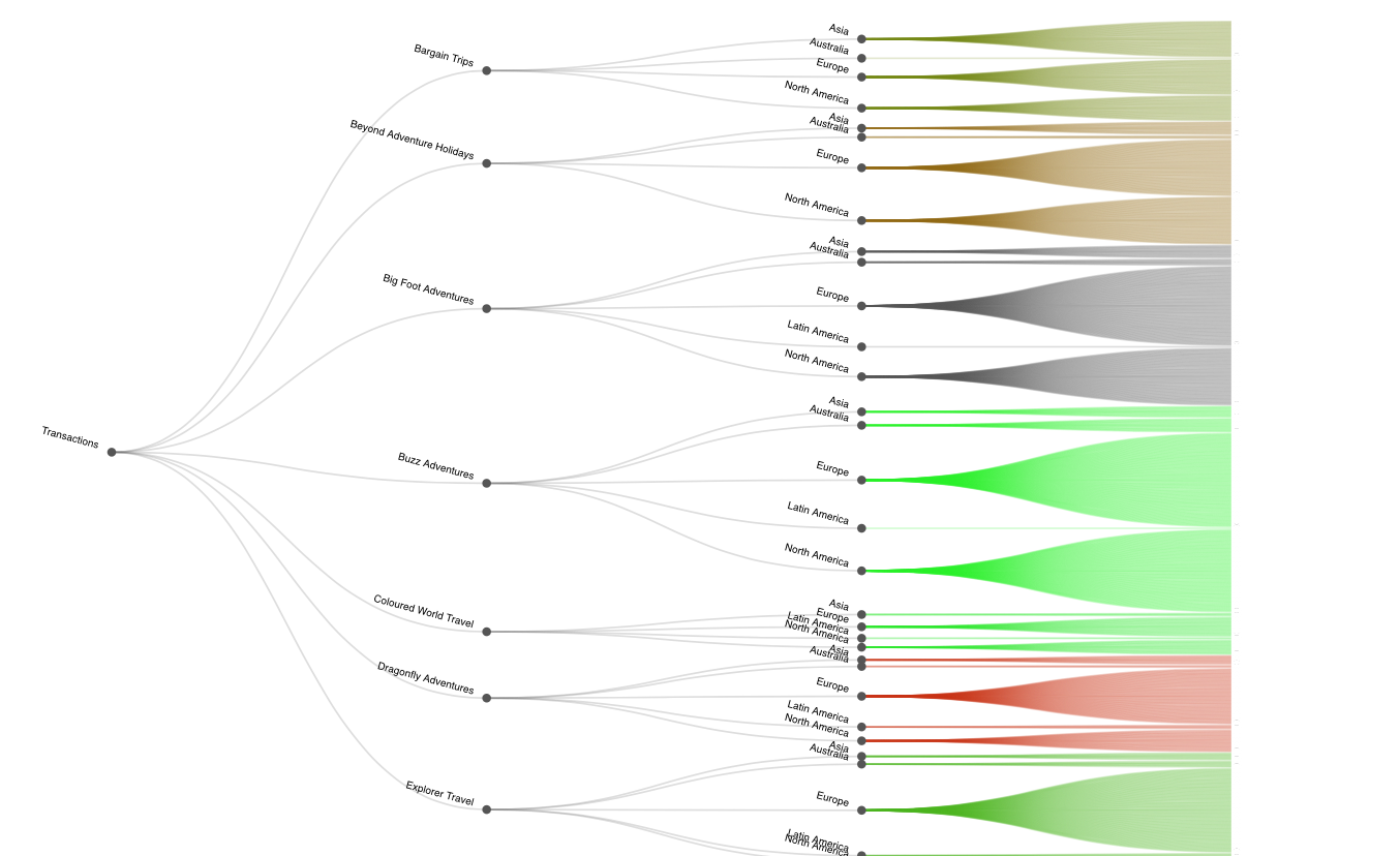
Dendogram capturing sales information


